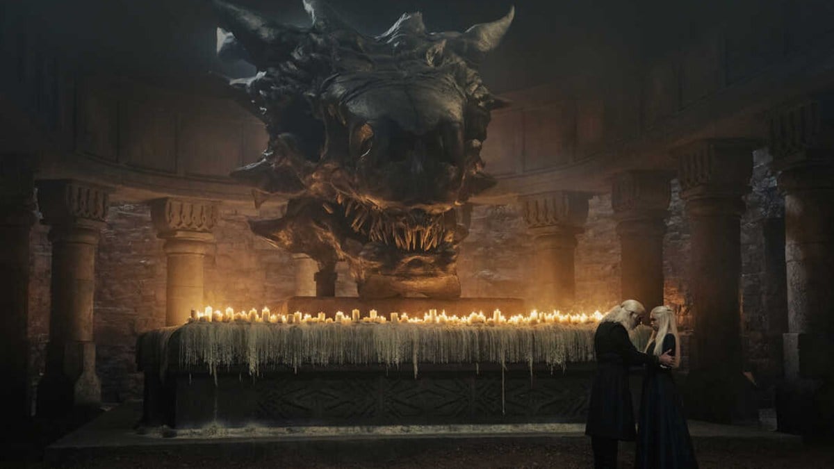
The Game of Thrones prequel House of the Dragon has already broken viewership records all over the globe, but that’s not all that fans are talking about. The show features some startlingly beautiful visuals, at least if you ask fans of the show over on the subreddit r/HouseOfTheDragon.
User samadgr shared a number of stills for the show along with the caption “Appreciation post for the first episode cinematography.”
Other fans were quick to agree, like user ksh12bro, who said “This show is already f*cking beautiful. I can’t wait to see more.”
User ILoveScottishLasses gushed over the show’s throne room depiction.
“I love the Throne room. I get why GOT had only so much to work with budget wise, but HOTD looks absolutely amazing with all the swords around. It’s close to being book accurate while keeping the iconic TV version.”
Others pointed out specific scenes, like J_Factor.
“The anamorphic lens shot of Daemon on the throne with the swords in the foreground as in focus as Daemon himself with the rest blurred and the light rays fragmenting into the room and diffusing in the air is probably my favorite shot in the episode.”
For those keeping score, an anamorphic lens is a specialty camera tool that affects how images are projected onto a camera’s sensor. It was made so cinematographers could fit more aspect ratios into a standard frame.
Of course, because this is Reddit, user AcreaRising4 pointed out that the lens was probably not anamorphic at all.
“Just to be that assh*le, I believe this show was shot with Arri DNA lenses. Has some similar flaring to anamorphic lenses but aren’t actually anamorphic. They’re actually super fascinating lenses, I’d read into them.”
The online community! Always very helpful. Another user pointed out that they enjoyed the tournament stadium scene.
“I thought it was clever that the tournament stadium looks like a vagina to echo the line from Aemma that the birthing bed was the woman’s battlefield. Really brings together the juxtaposition between the bloodshed of the tournament against the bloodshed of childbirth,” said user DJGrizzlyBear.
Someone else said they actually didn’t enjoy how King’s Landing was depicted.
“I’ll get used to it but it didn’t even seem like King’s Landing to me – so dim and drained of color, the light pale. Not a fan of that aspect,” said PourJarsInReservoirs. User AcreaRising4 disagreed: “I personally love it. It feels older and dreamy. Fits the vibe perfectly.”
A few users pointed out that the funeral scene was perhaps not up to the standard for the rest of the show, like Nerak_B.
“The first episode was shot very well! I noticed the costumes were nicer here than in GOT, however one of those dragon scenes had not so great CGI, I think it was the funeral scene.”
User Ryermeke pointed out a possible reason for that.
“They weren’t allowed to have fire in that location I think, they had to do all of that with CGI.”
User phoeinxfalke pointed out another epic scene shot beautifully:
“THAT SHOT when Daemon got dragged down the jousting rail. Anyone have a gif? It was an epic mini-moment. I jumped when I saw it. Super creative.”
All in all, everyone is super excited about the cinematography and that bodes well for the future of the show. You can read the whole thread over on Reddit.
The first episode of House of the Dragon is currently streaming on HBO Max.

