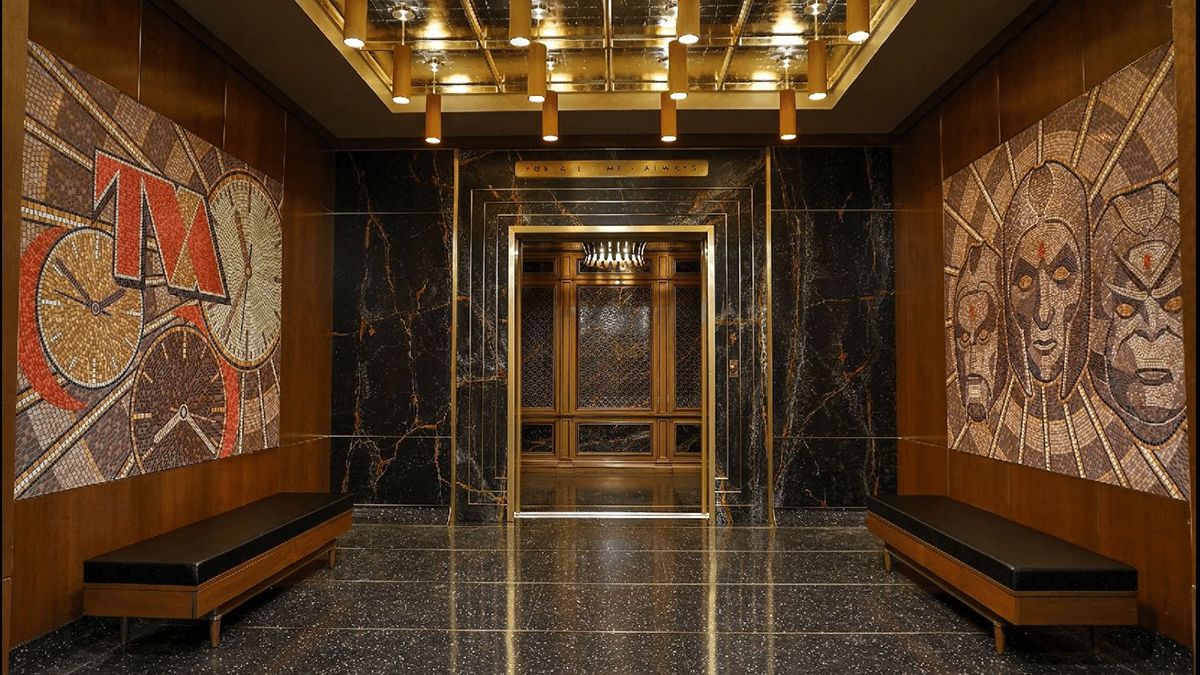
Superhero movies and TV shows generally all look the same. Glistening skyscrapers or saturated alien planets filmed with the most generic lenses, lighting, and cinematography you can think of set against LED screens or, worse, green screens, with visual effects which — under the tight schedule of the studio regime — are paradoxically getting worse despite the advent of available technology. Sometimes, though, a project comes along, miraculously granted enough breathing room to spread its wings and elevate the genre, if not narratively, then tonally and visually. Matt Reeves’ The Batman, WandaVision, Black Panther, and more recently Loki are four such examples.
Loki‘s unique voice
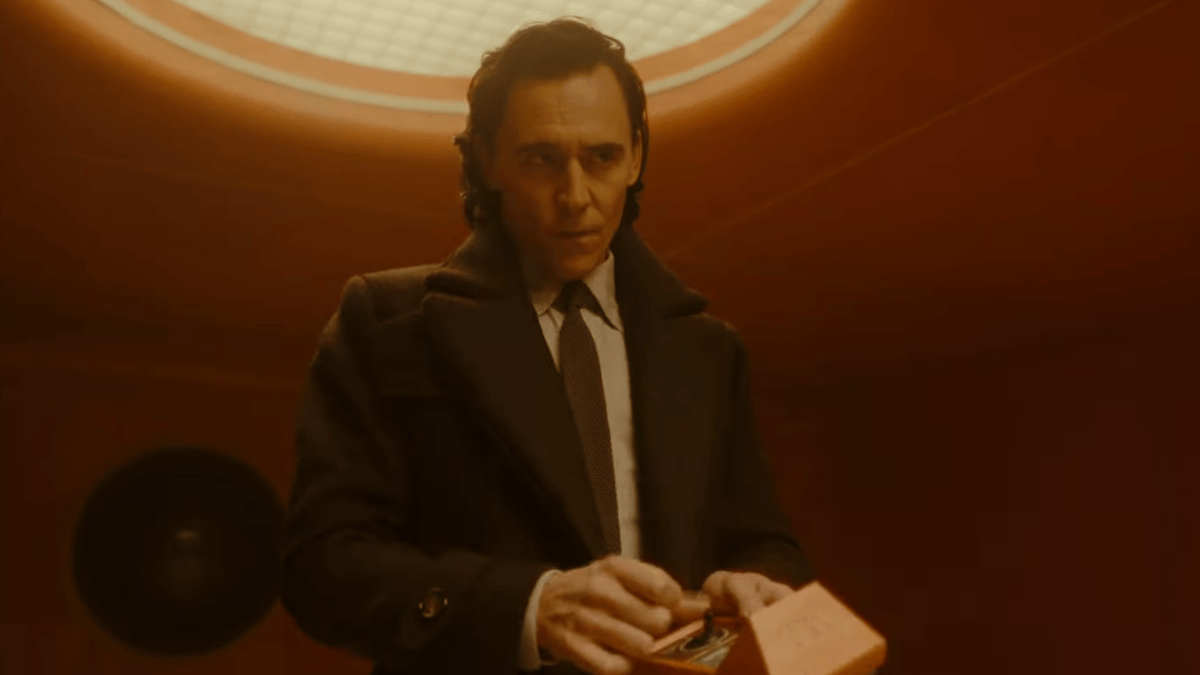
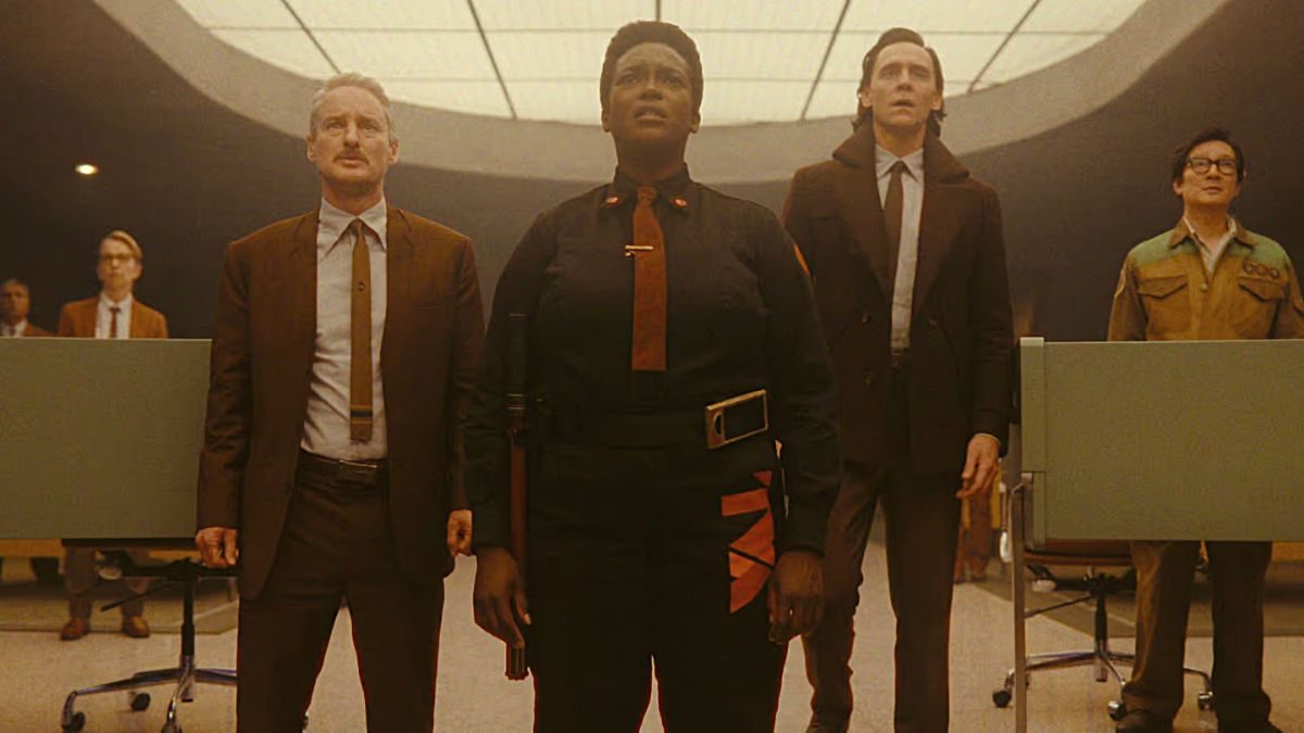
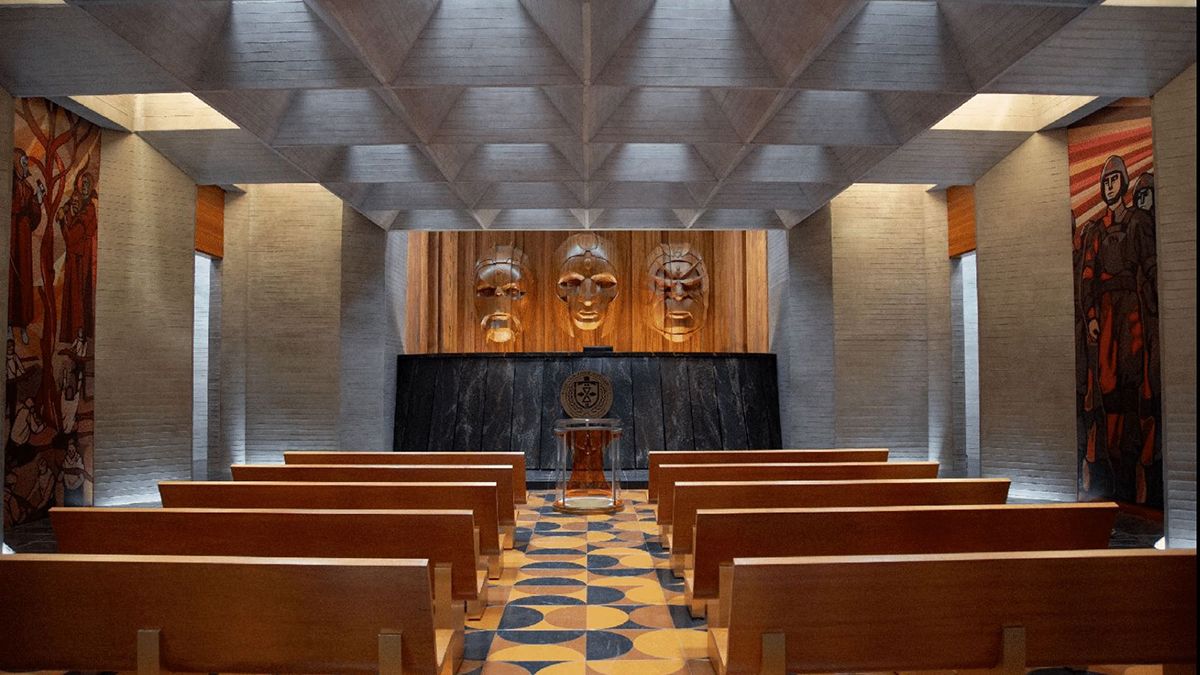
The various teams involved in production are given interesting new concepts and approaches to stories which are generally repetitions of things we’ve seen before. The thing is, though, at this point, every story has already been told, so the trick really is finding a new, specific personality that can differentiate what you’re making from what’s been made. With Loki, that individualizing mark was largely achieved through its idiosyncratic production and set design – which twists the futurism of the sci-fi genre into a vintage, stuck-in-time, bureaucratic atmosphere that is distinct from anything that’s been done by Marvel, DC, or other superhero juggernauts in the past.
What’s fascinating about this approach is that it wouldn’t be the first aesthetic you would think of when hearing the words “Time Variance Authority (TVA)” or picturing the show’s title character, the Asgardian God of Mischief Loki. Asgard and Norse mythology evoke a completely different look, much more akin to either the golden, heavenly feel of the Thor films or the dark blueness of media like The Northman or Vikings. The multiverse, on the other hand, hardly reminds anyone of the ’70s or early analogic tech, but rather quite the opposite – cutting-edge devices and heavily computerized imagery. The Loki team, however, chose to highlight a third driving force of the story they were setting out to tell – the excruciating and dehumanizing procedural routine of corporate bureaucracy that defines the TVA.
Capturing the peculiarity of the TVA
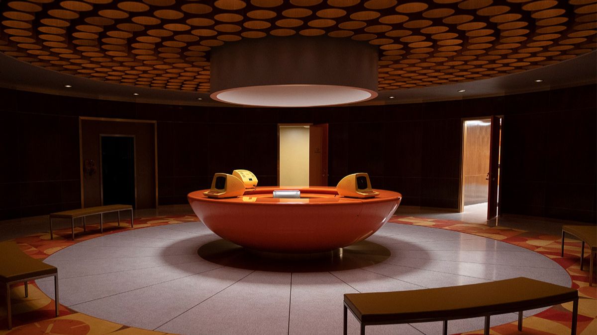
The TVA is an organization that doesn’t just exist outside of time but is also stuck in it. As production designer Kasra Farahani put it in conversation with The Verge, this, like many administrative systems in our world, was once at the receiving end of a large influx of money, but was simply never incentivized to evolve.
“In our fiction, [the TVA is] a bureaucratic organization that was probably super well-funded or incepted, or had been renovated in the post-war era. Imagine that a bureaucracy, or an organization that gets this massive infusion of resources at a certain point, and then doesn’t again for decades, and then they’re just using that same tech, and it’s slowly degrading.”
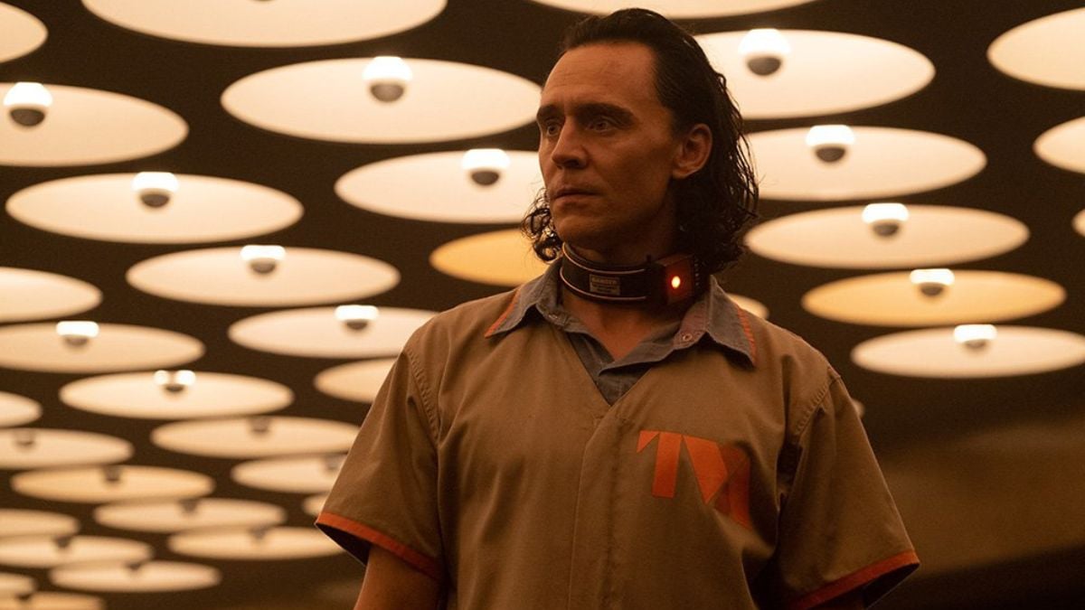
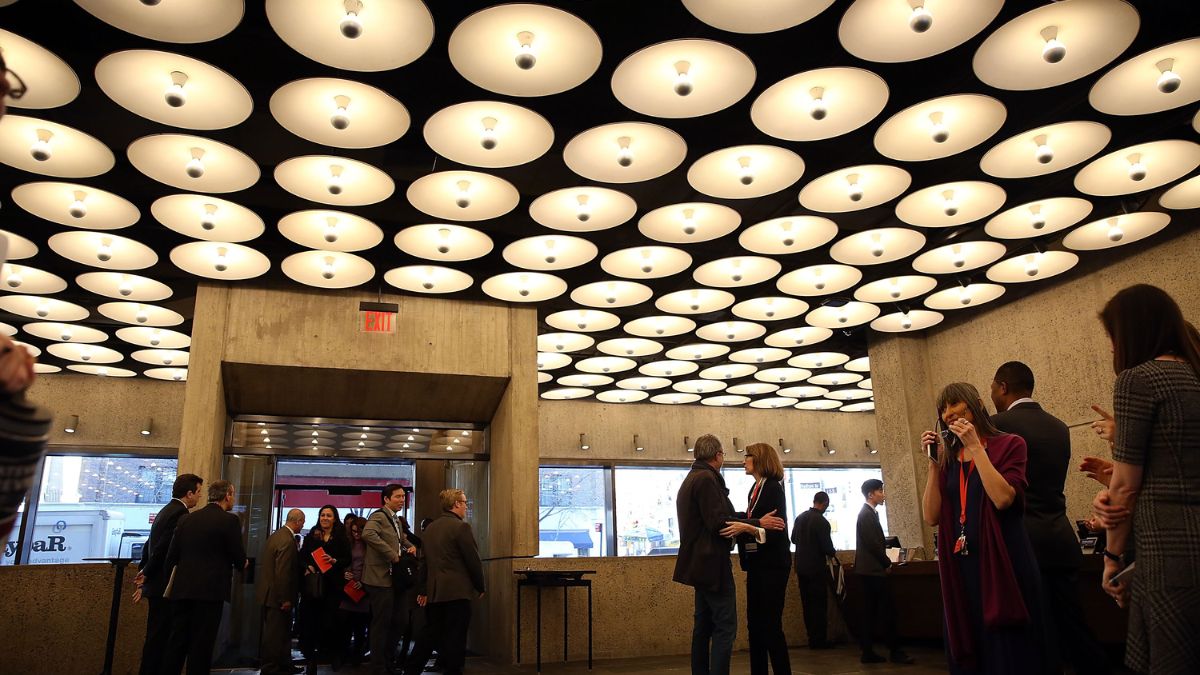
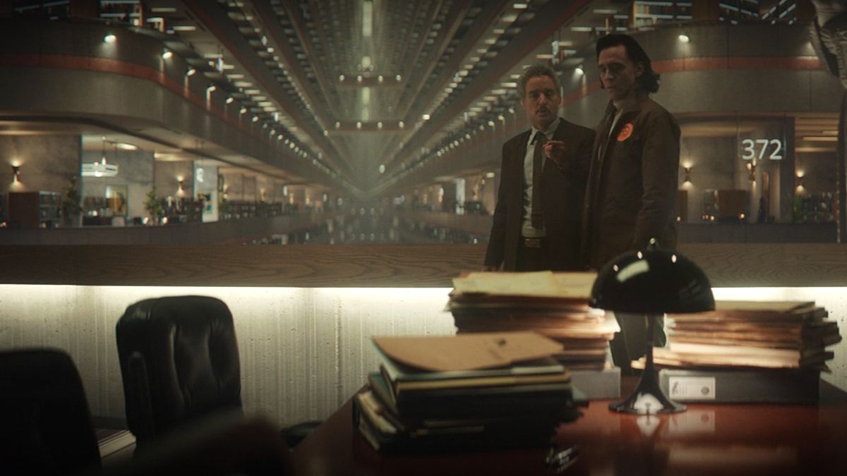
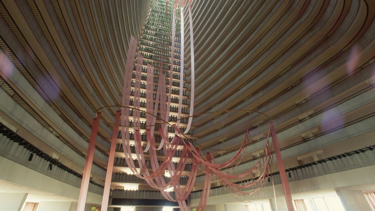
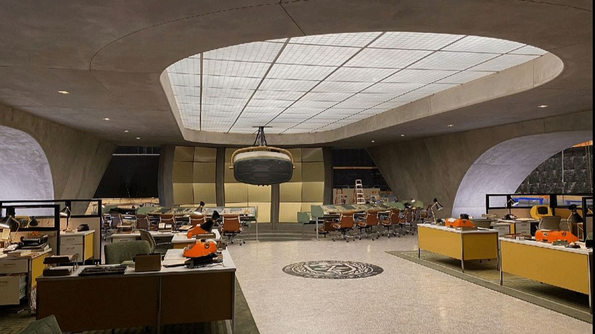
It’s not just the analogic, bulky computers contributing to this feeling either. The actual sets, built or otherwise, were all sourced and designed to fit this same “post-war” architecture, inspired by the Brutalist and Modernist movements of the ’50s and ’60s. The atrium in Atlanta’s Marriott Marquis Hotel designed by John Portman, for example, is a stand-out outsourced location set, used to shoot scenes set in the TVA’s archival wing, while the lamp-filled ceiling of the lobby of the Breuer Building in New York was replicated extensively on the sets of Loki.
The art department was given “Blade Runner meets Mad Men” as their launching pad to create a surprising fusion between the futuristic and the retro, which can feel jarring considering Loki‘s subject matter, but that makes perfect sense given the TVA’s own particular relationship with time itself, as an organization existing outside the stream of time and not necessarily dependant on evolution to survive. There’s a lot of Brazil — Terry Gilliam’s 1985 totalitarian retro-futuristic sci-fi dystopian takedown — in there too.
Bring back practical filmmaking!
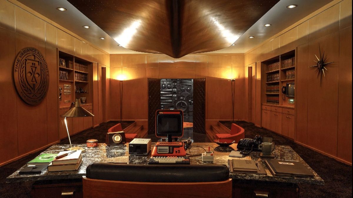
In the same way that the TVA as a concept pays tribute to a bygone era, so does the set design and decoration, the latter of which was handled by set decorator Claudia Bonfe in season 1 and Jille Azis and Jess Esmon in season 2. There’s an evident attempt to materialize everything within the scene, and rely as little as possible on post-production additions, just like the good old times. Props, like the chronomonitor, the red bubble monitor, and the hanging monitor, are all practical, Farahani revealed, with most — despite drawing inspiration from devices that did exist in the past — built from scratch in order to be functional for the show’s story purposes. These aren’t just stylistic whims – they’re impactful creative choices that can completely shift the feel of the show, as Farahani explained to BTL News.
“It was a lot of trying to find retro, nostalgic, real-world tech items, to integrate into the otherwise sort of fantastical setting to help ground it and make it feel specific, and not just like any kind of sci-fi thing, but to have a unique voice. Or try to, at least.”
Although we have only seen one episode of the second season, everything points toward this philosophy being retained and doubled down on. Visual effects also seem to have improved in comparison to other recent Marvel properties, with Secret Invasion and Quantumania being particularly harrowing examples of what not to do. The key — we would be inclined to guess — is probably the fact that Loki is the first Marvel project ever to not need any reshoots, which hopefully allowed its VFX team to do their best work, without being submitted to suboptimal working conditions.
Why season 2 of Loki looks better than season 1
Having said all this, while the production design had fascinated me in season 1, there was something about the look of the show then that put me off. I found the color grading — with its pukey (for lack of a better word) blue and greenish tints — to be genuinely ugly. That feeling with this new episode was replaced by satisfaction and wonderment, and I found myself wondering if my taste had just changed over the last couple of years. I couldn’t put my finger on it, but research led me to discover that the cinematographer had changed.
Isaac Bauman is now handling the photography for Loki, and he was kind enough to share on his Instagram page all the tiny little adjustments he made from season 1 – from which cameras and light bulbs he used to the camera work and filters employed. Cooler, sharper LED lighting, for example, was replaced with the warmer, softer tones of tungsten lights. Likewise, the new directors for season 2 —Justin Benson and Aaron Moorhead, who had previously done Moon Knight — were adamant about interposing what Bauman calls “studio mode filmmaking” (reliant on dollies, cranes, and Steadicam) with a lot more handheld camerawork for a sense of “immediacy, naturalism, and immersiveness,” bringing authenticity and unpredictability to a genre that, visually, tends to be the exact opposite.
It’s safe to say that the first episode of Loki‘s second season has gotten us feeling hopeful about what’s to come. As Loki, Mobius, and the rest of the TVA gang time-hop to the ’80s McDonald’s where Sylvie is now working or the early 20th Century to meet with Victor Timely, we’re already anticipating all the marvels Farahani, Azis, Esmond, and Bauman have lined up for our eyes to feast on.

