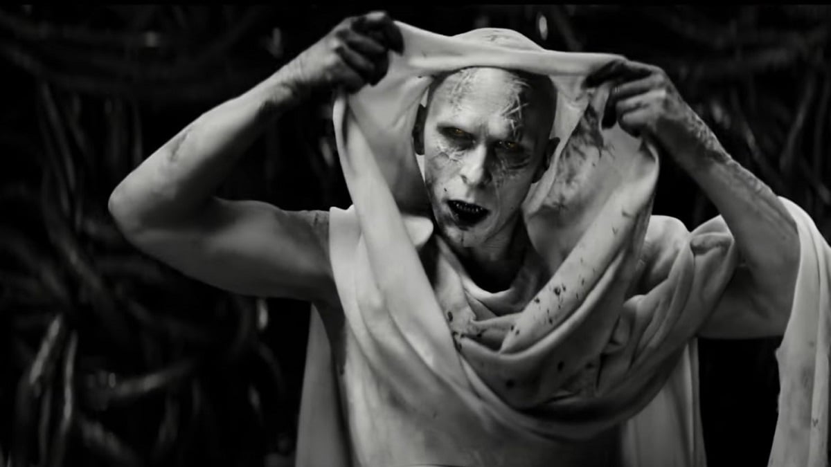
When it comes to adaptations, it is likely that your favourite book or comic book characters aren’t going to look exactly the same on the big screen as they did in your mind or on paper. That was the case for Thor: Love and Thunder villain Gorr the God Butcher, who had some changes made to his character design for the MCU film. Thanks to visual artist Jackson Sze, however, we can see what a more comic book accurate version of the character might have looked like.
Sze is a visual development supervisor for Marvel and shares his concept art on Instagram and Twitter. For this image, he wrote that this was his “first take on the #gorrthegodbutcher for #thorloveandthunder before the amazing #christianbale was cast in the role.”
The image shows a more alien-looking design than what we got from the film, with tentacles coming from his head and only two toes on each foot. The character is slightly more jacked than Christian Bale’s version, a decision that must have been made prior to filming as we all know that Bale can muscle up if he wants to.
The necrosword Sze drew is also more similar to that of the comics, jet black and with a gap in the middle, definitely more futuristic and otherworldly, whereas the one used in the film looks more reminiscent of a sword one might expect to see in the European middle ages.
It’s always interesting to see how these changes come about in the pre-production of filmmaking, from the initial character design to the final version.

